SHP: Identity Matters
Founded in 1948, SH Pratt has built a reputation as a leader in the growing, ripening, importation, and supply of tropical fruit to the UK. They came to us wanting to develop a new brand identity that would position the company as an innovative and forward-thinking leader in the tropical fruit industry, without losing sight of their heritage.
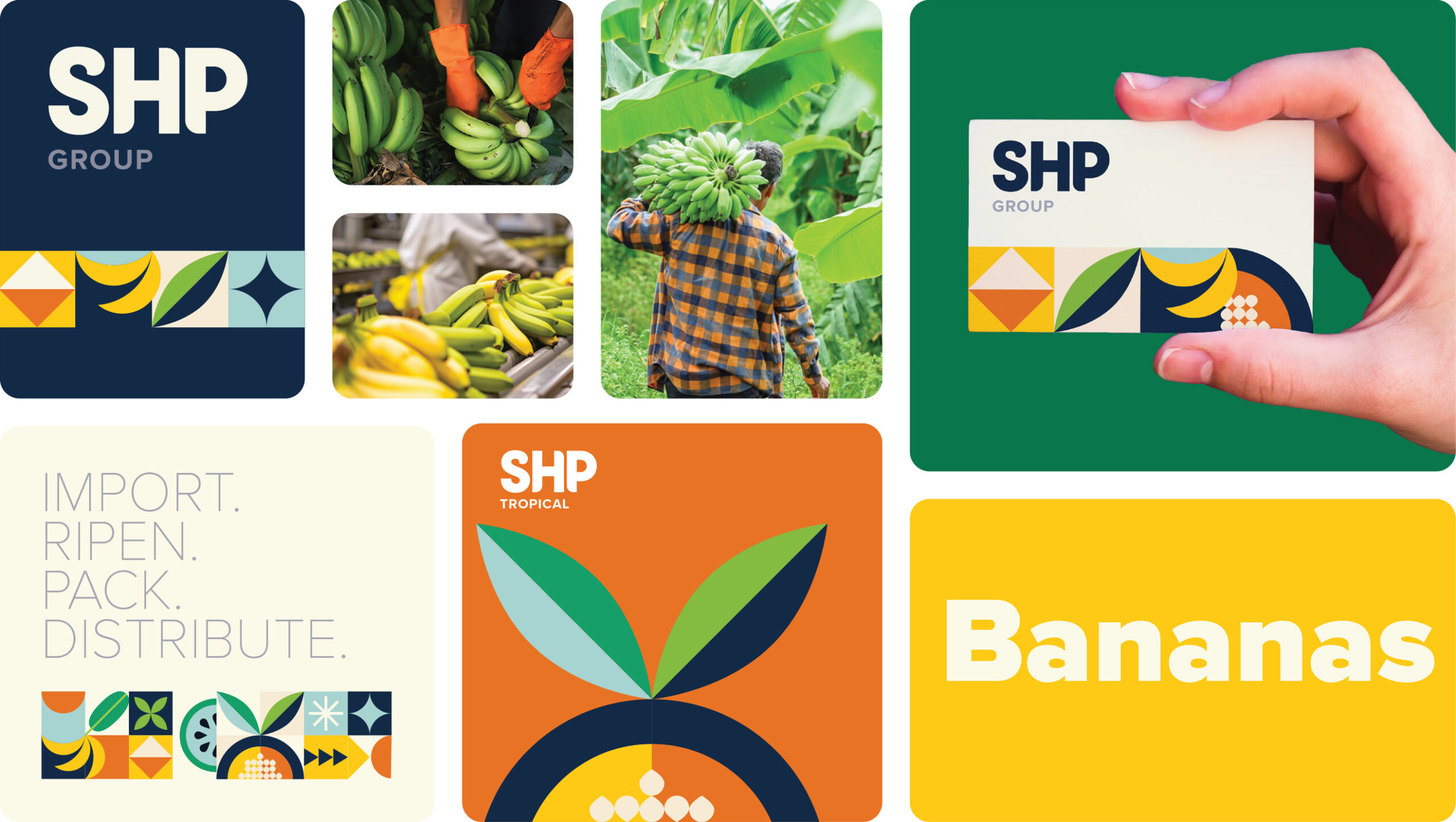
We first began with a name “makeover” – shortening the existing SH Pratt to SHP. The company’s long-standing reputation was something that we wanted to keep a connection with. The name refresh was the starting point in the unification of the business. The various divisions of the company were brought under the SHP umbrella, allowing the organisation to showcase its size and leading industry position more effectively
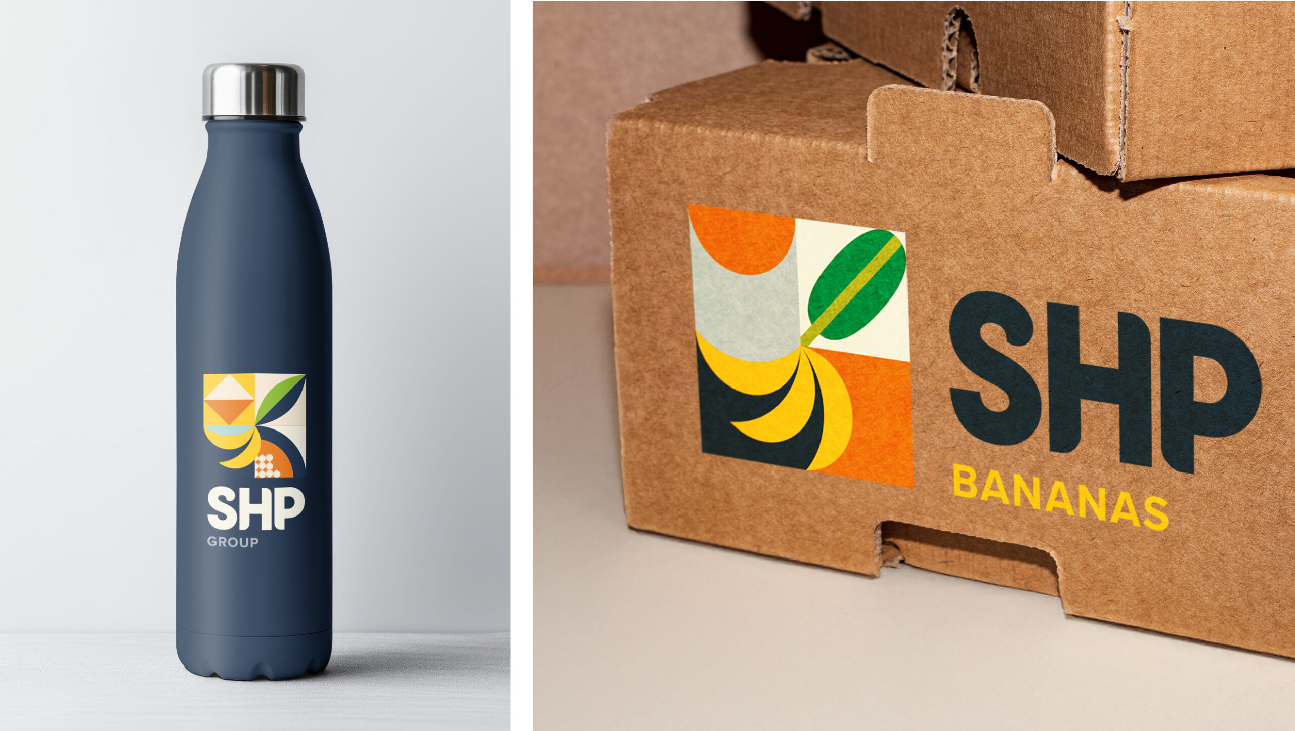
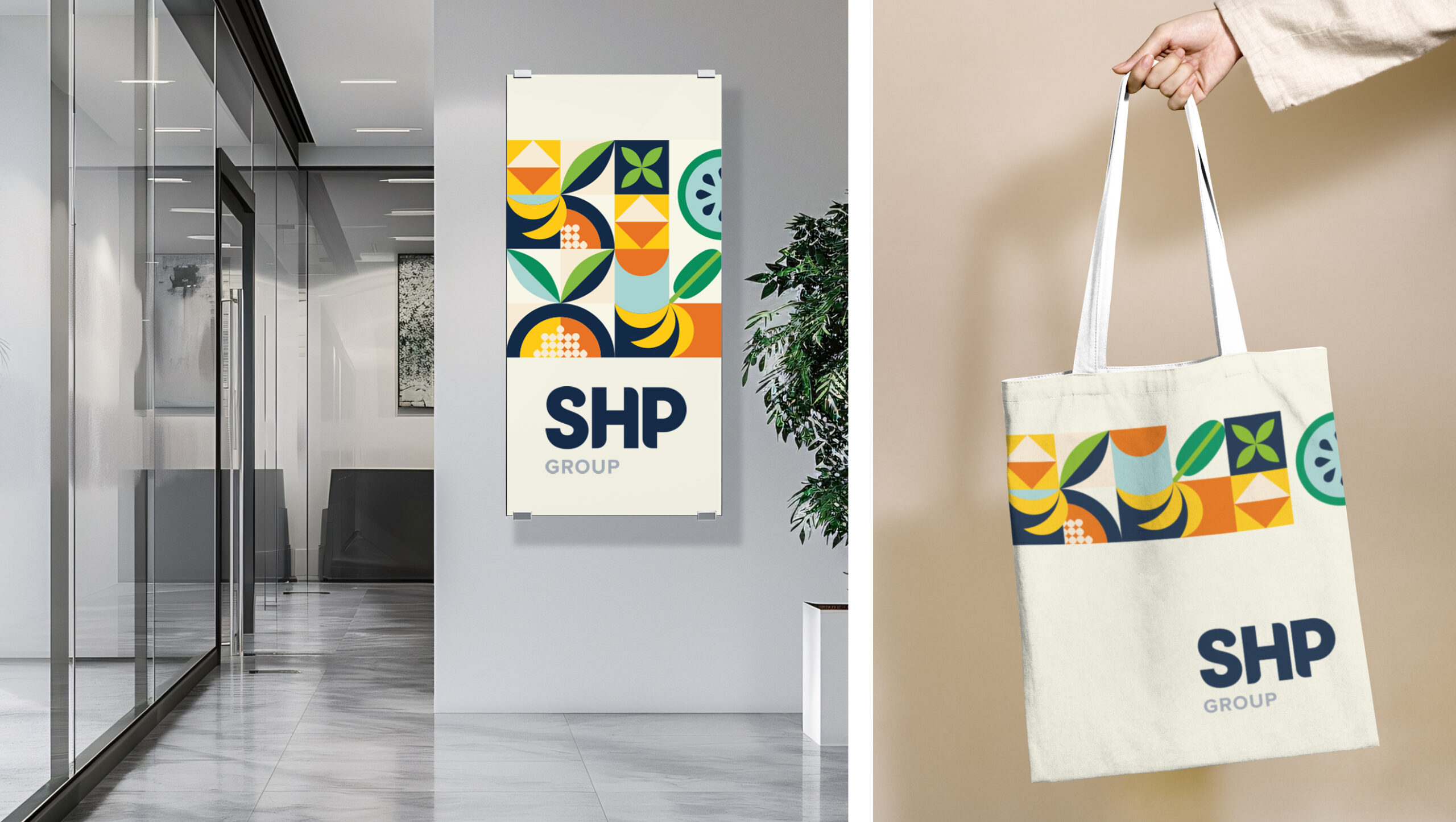
We explored different visual routes into a new identity system that is flexible and codified, delivering consistency and recognition across packaging, digital platforms, physical spaces, and beyond. By using stylised blocks, the divisions of SHP could be differentiated whilst remaining part of a whole – something that was important to the client. The outcome included a new company logo and refreshed brand guidelines. A dynamic colour palette inspired by tropical fruit hues (vibrant yellows, greens, and deep oranges), balanced with neutral tones for professionalism.
The client was happy with the new branding, and we started rolling it out across the business. A completely new website was the first job on the list, followed by brand collateral such as physical and digital internal comms templates, fruit stickers and social media content.
By deeply embedding SH Pratt’s values and legacy into a modern identity system, we helped the company solidify its reputation as a market leader while preparing it for future growth. This project underscores the power of design in connecting businesses to their heritage while driving them toward a brighter, more impactful future.