Packaging designed for adaptation.
Our work for Lidl is a good example of a relationship with an agile retailer that has embraced a wide range of design and adaptive design and art-working projects.
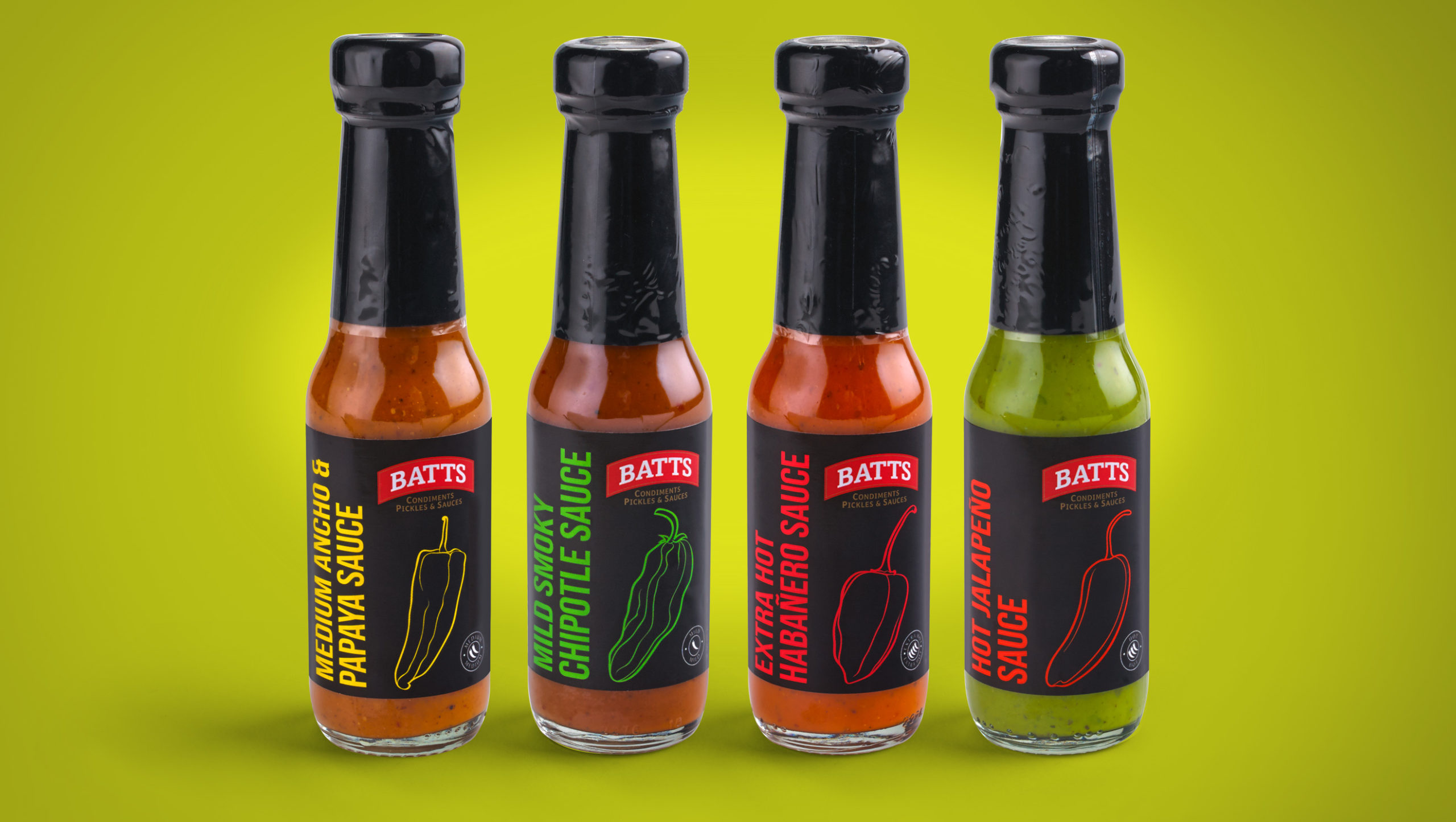
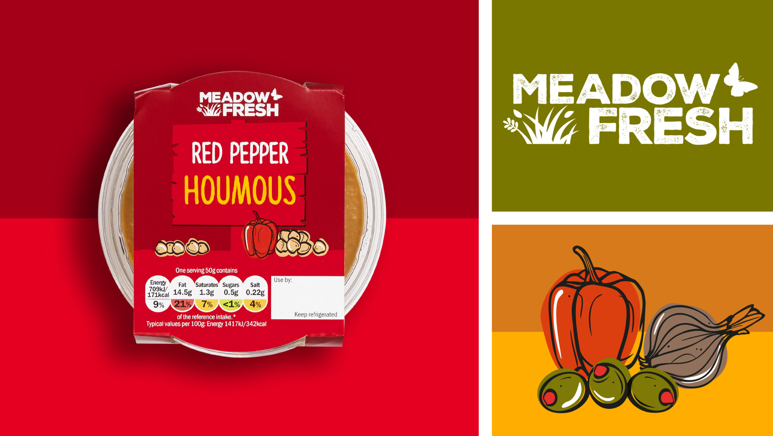
We’ve been working with Lidl for almost a decade during a period when their business has expanded rapidly and seen them grow to become a key player in the UK food retail sector. The Lidl offering is built largely around their tailor-made own brand offerings, each with its own sector-relevant name and design. We have worked across all manner of Lidl ranges, including Deluxe, Batts, Meadowfresh and Simply to name but a few.

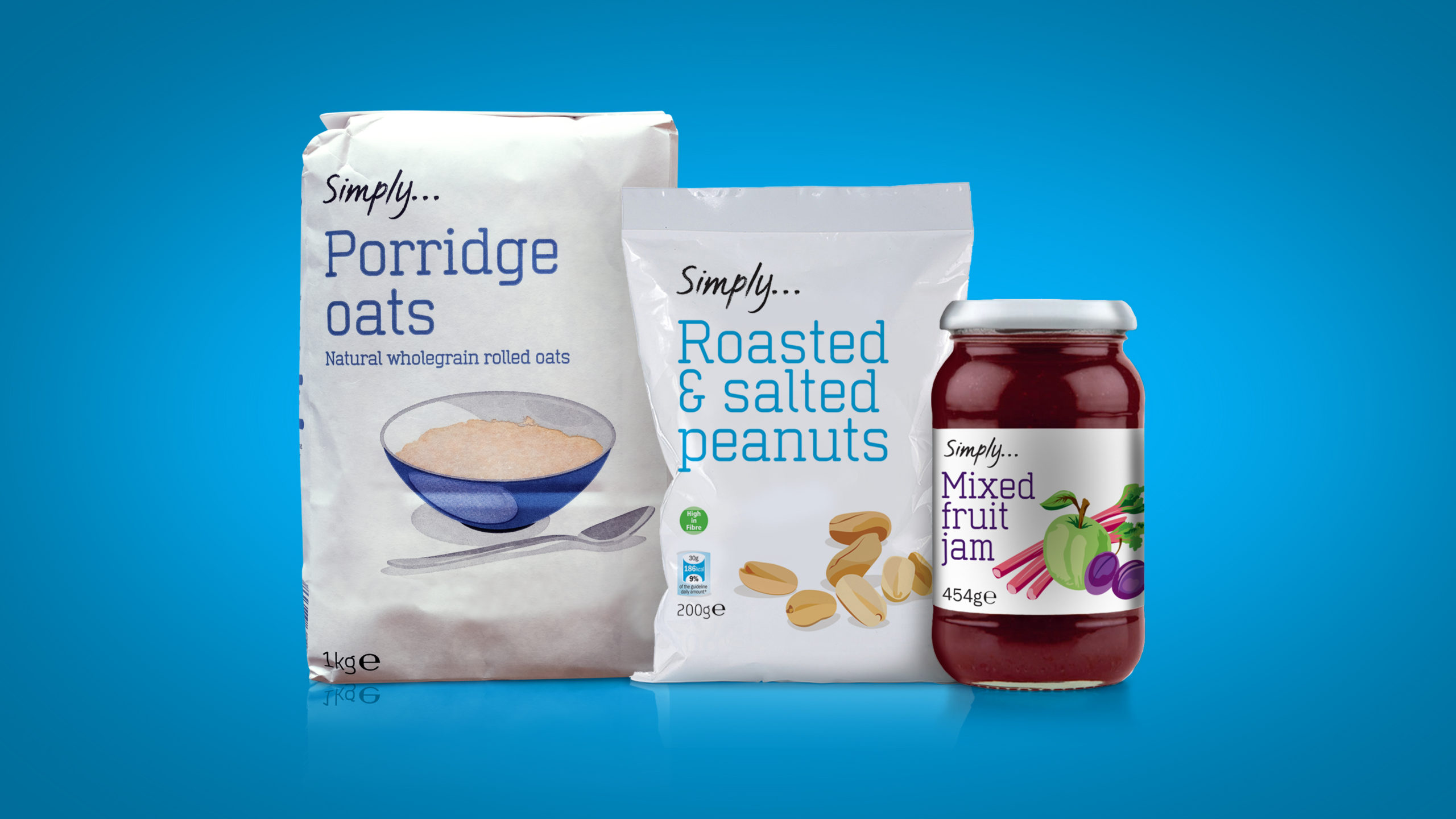
One of the key projects that we were asked to deliver was the design and implementation for their Simply range. Originally briefed as a range that would consist of everyday basket essentials, we knew from the offset that it had the potential to be much bigger.
‘Value’ ranges of own label products have changed significantly in recent years. The early incarnations from the earliest days of supermarket own label often suffered from poor reputations of quality. However, by working with trusted supply partners, Lidl have ensured that their products deliver reasonable quality, at highly competitive prices.
Our design for Simply needed to reflect the balance between clearly signalling this great value with appropriate, reassuring quality cues.
With this in mind, we created a packaging design that worked to the stigma in shopper’s minds that white means ‘value’. But with the addition of clever little illustrations, we were able to purvey a sense of care and quality. This reflected positively onto the product inside which we were confident wouldn’t disappoint.
Our intuition proved correct as since its launch, Simply is now part of virtually every fixture across the Lidl stores and its full range includes hundreds of products (yep, we’ve counted them!)
If you’d like to find out more about our work to create impactful own label brand designs, take a look at our work for Poundland here – link to Poundland Make Up Gallery case study.
