Grown not manufactured.
Founded in 1990, Bioterra is one of the top almond producers in Spain. They have been pioneers in organic almond production since 1996 when official standards defining organic produce were only just beginning to be formulated. Bioterra products come straight from their own audited farms and are grown sustainably and without intensive agriculture systems that can significantly reduce the quality and flavour of the almond.
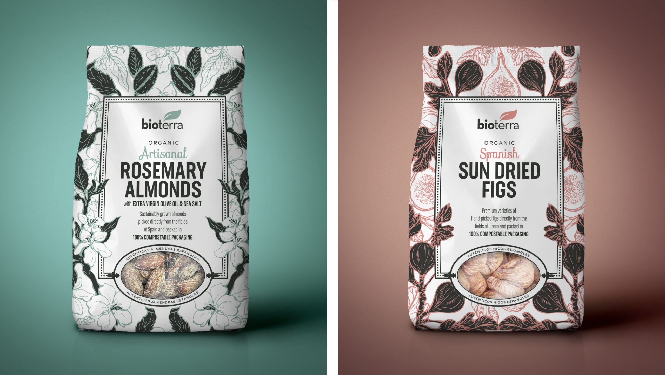
Their innovative approach to almond production creates a unique and sustainable way to eat almonds that are grown to be tastier, healthier, and this helps to reduce the environmental impact. As well as having an array of Almond products, Bioterra’s organic portfolio also includes sundried figs.
Bioterra came to us in need of a packaging design refresh. They were having lots of interest in launching their organic products into America and Canada and with goals to eventually go global they required a strong and confident packaging design to enable them to deliver this.
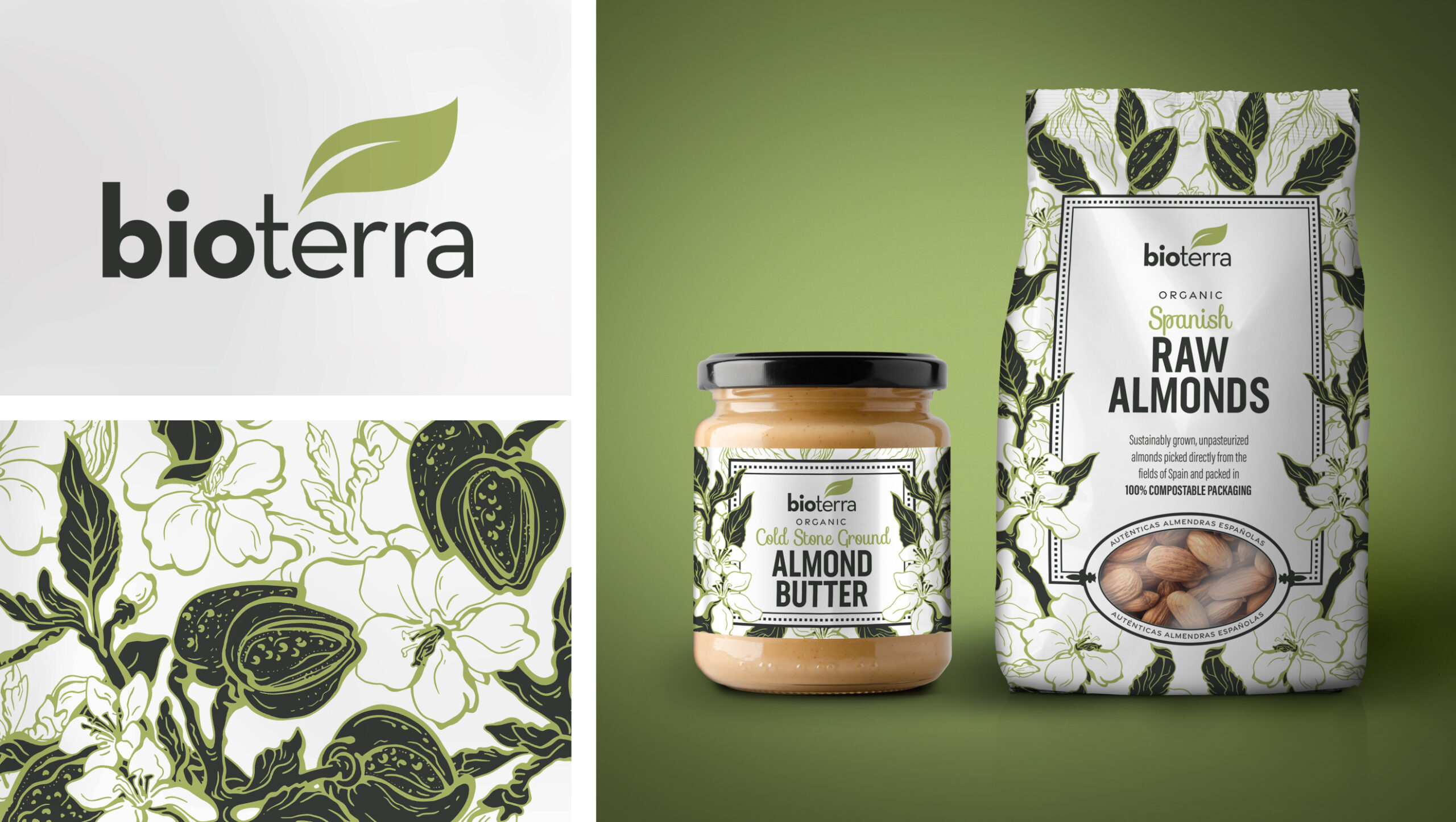
To support Bioterra’s ambitions to grow their brand globally and to shout about their innovative and unique almond production, we worked alongside them to bring their design vision to life. The brief was to create a design that would differentiate them from the private label and competitor brands and emphasise the premiumness of the range by reflecting the quality of the almonds. To do this, they required an emphasis on key messages to promote their company’s virtuous values such as social and environmental responsibility, quality, and traceability.
The end result uses beautiful botanical illustrations of almond tree foliage which reflect the organic nature of the product and the strong heritage of the Bioterra brand. Fresh contemporary colours highlight the delicate illustrations and help differentiate the products across the range. The full Bioterra story is featured on the back of pack and the many important claims are incorporated through a combination of icons and typography.
It’s a pack design that will help bring organically produced almonds to the masses.
