Type trends for 2024
Fonts, Type, Typesetting, Typography… whatever you choose to call it, it is an integral and essential part of communication. It can influence how we understand information, it can eat into our subconscious and influence our purchase decisions, it can affect our emotions and reactions – all powerful stuff from a series of letters. Our type expert Geoff explores some of the up and coming things that we should look out for in the coming year.
Get into the groove
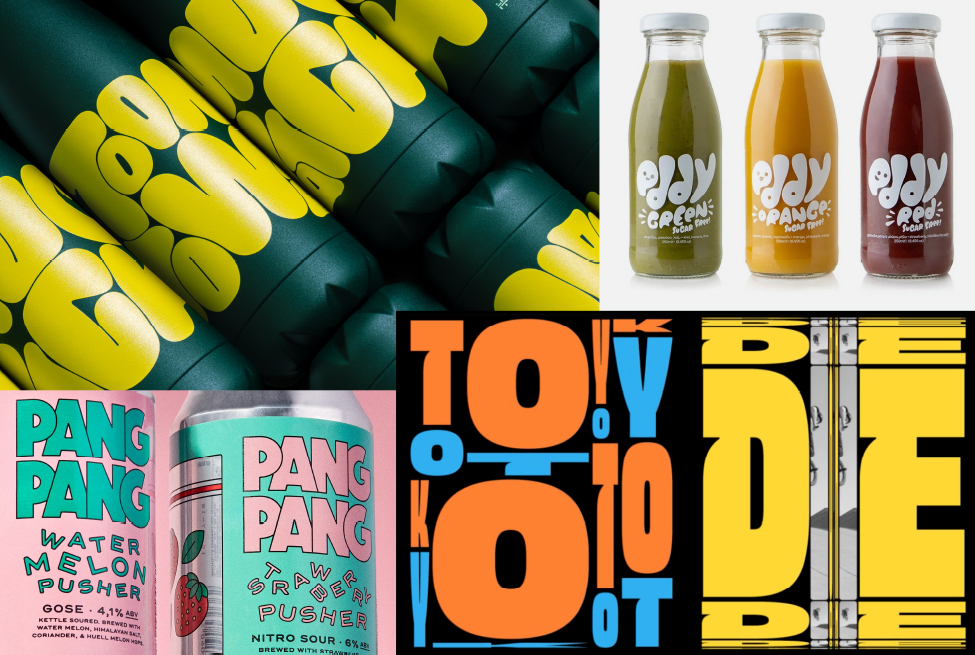
Bit of a 70’s vibe going on here with some nice organic, curvy wordmarks and cute playful illustrations to help the story along. Food photography features a saturated Kodachrome style that perfectly fits with the groove baby!
Mr Blobby
Blobby, wobbly, chunky and funky text that’s the actual graphic element.
Fun, fluid, thicks and thins, energetic and fully funky for 2024.
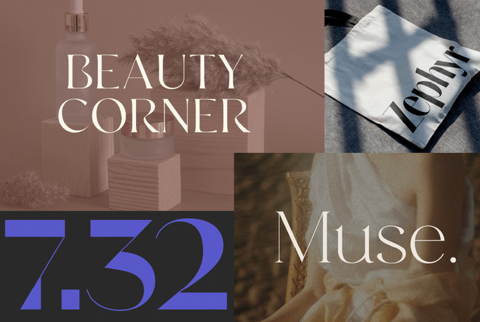
The semi-serif
Encompassing the elegance of a classic serif and the clean simplicity of the sans serif, the semi serif can create a unifying personality, and with multiple weights and iterations tie together a complex brand architecture.
Style council
Sophisticated typographic treatments for magazines, headlines, logos, packaging and beauty products – elegant and creative typographic compositions often accompanied by a set of attractive ligatures. Beautiful typography take a bow!
Flat pack
A simpler, more impactful look but with offbeat typography that has a “Never thought that could work but it actually looks great” cool vibe to it.
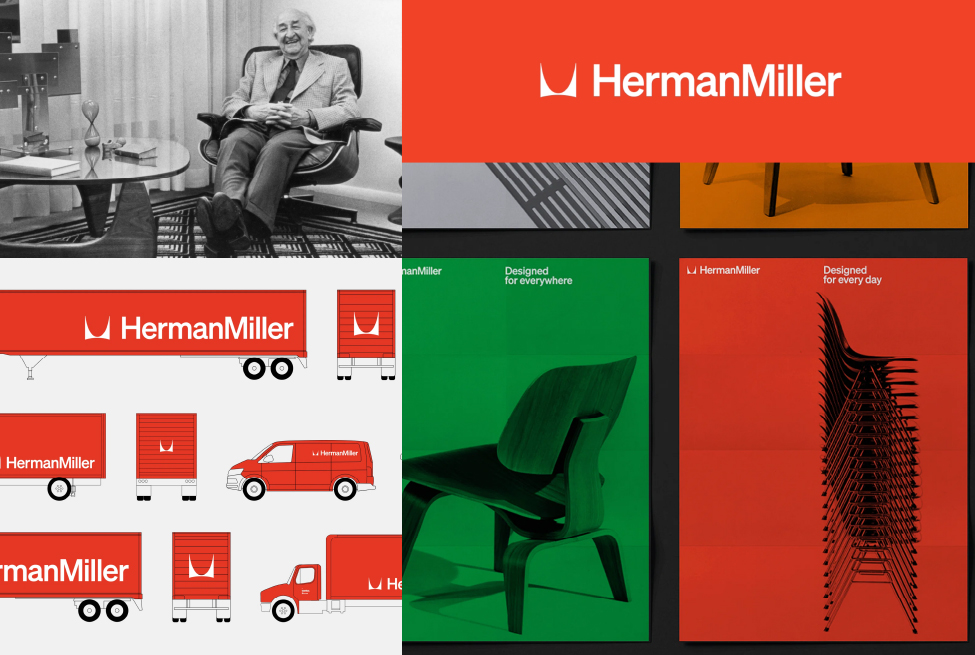
The softer sans
The popularity of sans serif has grown exponentially with the need for greater clarity on the small screen. Over blandness can be avoided by the deployment of a slightly quirkier sans with subtle design features that create a bit more personality.
A (sort of) new look
Celebrating a century of craftsmanship and sustainable design the new wordmark references a time in the 60’s when Helvetica was used. Söhne from Klim Type Foundry has been chosen as a continuation of Helvetica, but the logo has been left largely unchanged.
Go with the flow
Movement or animation is a given these days, whether it’s mainstream commercial as in the Soreen ads or more esoteric as in the Spotify Wrapped end of year summary. You ain’t seen nothing yet!


