Giving meaning to Responsible Pioneers
Countries all over the world are committed more than ever to reducing greenhouse gases and perhaps none more so than the United States – particularly in the Gulf Coast region (Southern Louisiana and Texas). The Gulf Coast of the USA has a significant industrial sector that accounts for 61% of all US greenhouse gases.
Gulf Coast Sequestration (GCS) is a major initiative/organisation that has been established to play a pivotal role in the reduction of greenhouse gasses by capturing CO2 and then sequestering it 9,000 feet below ground in a specific kind of rock formation. This process of burying CO2 deep underground is not only safe but secure and permanent.
Over the next 10 years GCS will have the ability to remove 300 million tons of CO2 from the environment. This level of CO2 reduction can potentially abate $11.3 billion in climate related damages while delivering close to £1 billion in Gross State Product.
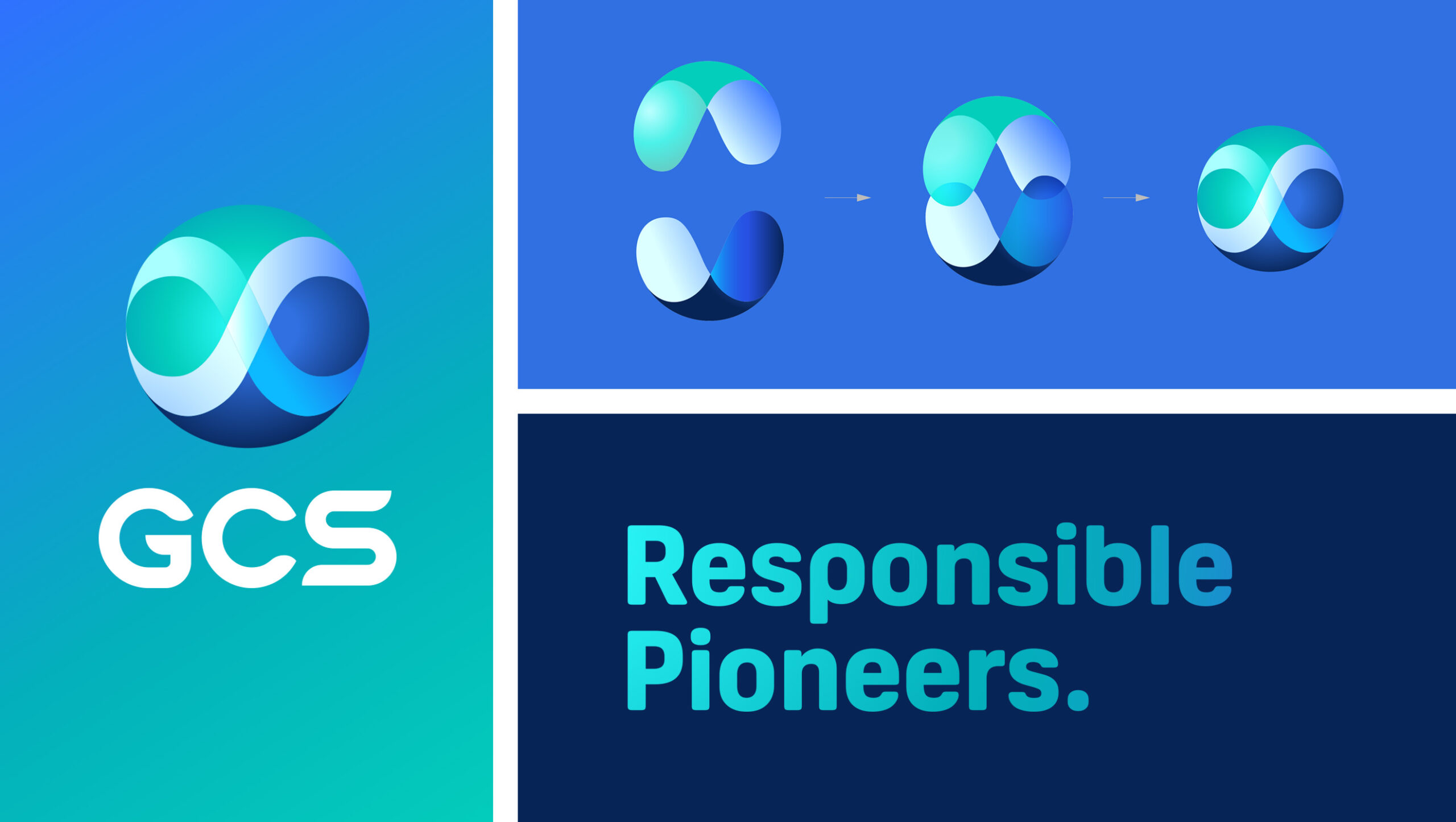
An ambitious ‘pure play’ organisation needed an ambitious single-minded idea for the relaunch of the brand. Previously the company had an interpretation of a globe comprising three curved panels to make up the rough outline of the earth. It felt generic and quickly put together to enable the business to go to market.
Our solution had to be a relaunch of the identity as opposed to a full rebrand, so our initial step was to hold a workshop with the stakeholders of the business and understand their future ambitions. The outcome of that process was that they unanimously wanted to retain the spherical architecture, and for very practical reasons they wanted to truncate the name to GCS. Finally, throughout the session they wanted to make sure that the revised identity clearly showed that the work they were doing would capture carbon forever.

Working with the existing curved panels we undertook some exercises to see how they could be configured differently to create a revised identity for the business. As we altered the geometry of the panels as well the varying intensity of the colours and reduced the panel numbers from 3 to 2, we found that they came together to deliver a scientific feel. Once the panels were separated slightly, they created a visual effect reminiscent of the Möbius strip which has been long used to indicate infinity – something the GCS wanted to show in the identity.
New typography was developed for the identity to support the globe, and the shaping of the letterforms hold the same circular architecture to create harmony between the typography and the main symbol.

