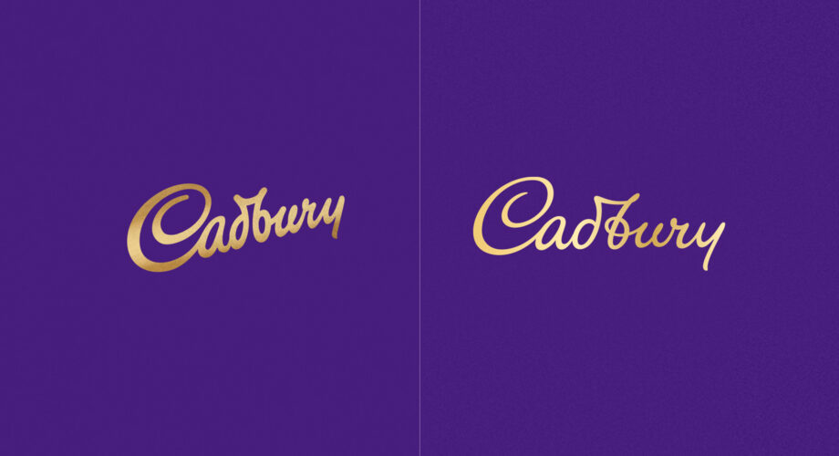
Cadbury’s brand refresh
Over the last few months we’ve seen some of the world’s most iconic and recognisable brands reveal a new look to the world – Warner Bros, Heinz, Fisher-Price and BMW to name a few. Cadbury’s chocolate has now joined that prestigious list and we suspect they may not be the last!
Let’s start with the brands famous signature. This has been reworked and crafted with a more contemporary open and airy feel showing off its cursive architecture and at the same time drawing inspiration from historical reference which capture the quirks from the original hand drawn signature of founder John Cadbury.
Why have they done this? Firstly, they’ve sought to reinvigorate a familiar household name – It’s a good example of remembering and rejuvenating what made you famous. Secondly, it’s about evolution and changing with the times to remain relevant. The new logo is a subtle evolution that gives us a thinner, more elegant interpretation.
You may not notice at first glance, but subtlety is key and we are seeing this with other iconic brand refreshes. Warner Bros unveiled their new logo earlier this year – again a subtle change to a flat design but this a trend emerging with other brands in a response to ever increasing use of digital media.
However, the signature on its own is not enough. The iconic ‘glass and a half’ milk glasses, ‘that’ purple and a new background pattern based on a design from the 1900’s all amount to a refresh of what made Cadbury’s famous from the start.
By dipping into the archives to unearth some past assets that have been beautifully reimagined, Cadbury’s has enhanced the comforting appeal of what is essentially mainstream milk chocolate that has made them a household name.
Cadbury are in a position to be able to work with the best typographers and designers in the business. For Cadbury it’s well worth making the investment as that signature has been and will continue to be a major facet of its visual identity.
It’s important not for this industry but for client as well that not everything can be created in-house; it often makes for insular thinking. We need to use the best of the specialist disciplines – photography, illustration, writing etc. As this broadens our minds and ultimately delivers better work.
A good example of this was commissioning Leeds based illustrator Mick Marston to create a range of illustrations for a new business drive initiative we were working on. They made the work look interesting, intriguing and eye catching.